
NDIS website design: what good provider sites show, with real examples
What good NDIS provider websites show in the first screen: can you help, where and when. Real provider examples, a coordinator referral form, WCAG 2.2 and a checklist to brief your web designer.
Most NDIS website design advice stops at “make it accessible and mobile-friendly”. That’s the floor, not the goal. A useful provider website answers three questions fast: can you help, where, and when can someone start?
This guide shows what good NDIS provider websites do, with a real provider page for each idea, plus a checklist you can hand to whoever builds or updates your site. I’ll also say where I disagree with a lot of the advice out there, starting with this: an accessibility widget is the least important item on the list.
I’ve looked at this from the agency side. We designed the website and landing pages for Auscare Support as part of work that doubled its client base in six months, and I checked every example below on 19 November 2026. If you want the wider picture first, here’s how we approach marketing for NDIS providers.
Good NDIS website design starts with three visitors, not one
An NDIS provider website has at least three audiences, and they want different things:
- The participant wants to know if you offer the support they need, in plain words, and whether they’d feel comfortable with you.
- A family member wants to know who the team is, how support works day to day and what happens after the first call.
- A support coordinator (or a plan manager, or a local area coordinator) wants three facts, fast: your capacity, your service area and how to refer.
Most sites are designed for the first visitor and forget the third, even though coordinators send a lot of the work. And don’t forget the phone: the ABS found that 28.5% of people with disability hadn’t used the internet in the previous three months (2018 data, the latest it has published). Your website has to make calling you easy too, not replace it.
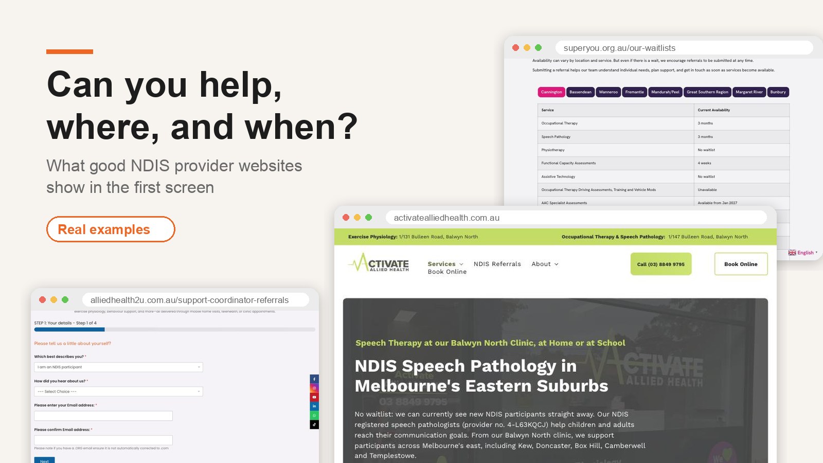
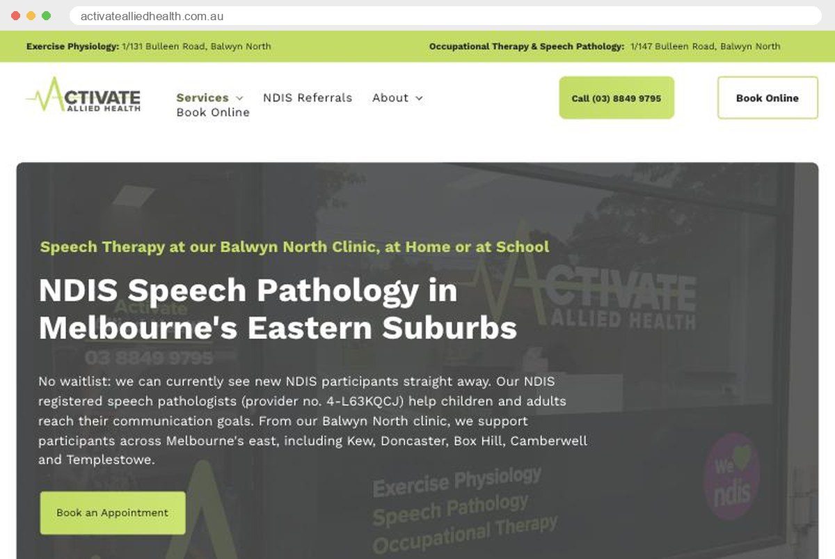
Here’s what answering all three questions in one screen looks like. Activate Allied Health’s NDIS speech pathology page says it can see new participants straight away, names the suburbs it covers, shows its NDIS provider number and puts a call button at the top.
Show wait times by service and location
This is the biggest gap on the provider sites I checked. A coordinator with a participant who needs an OT next month doesn’t want to ring five providers to hear “we have a waitlist”. If your site doesn’t say, they’ll call someone whose site does.
Superyou Therapy’s availability page is the most specific I found. It has a table for each of its eight WA locations, with the wait for each service: three months for OT at one site, no waitlist for physio, four weeks for another service. That’s exactly what a coordinator needs. I couldn’t find an update date on that page when I checked, so a visitor can’t tell how recent the numbers are.
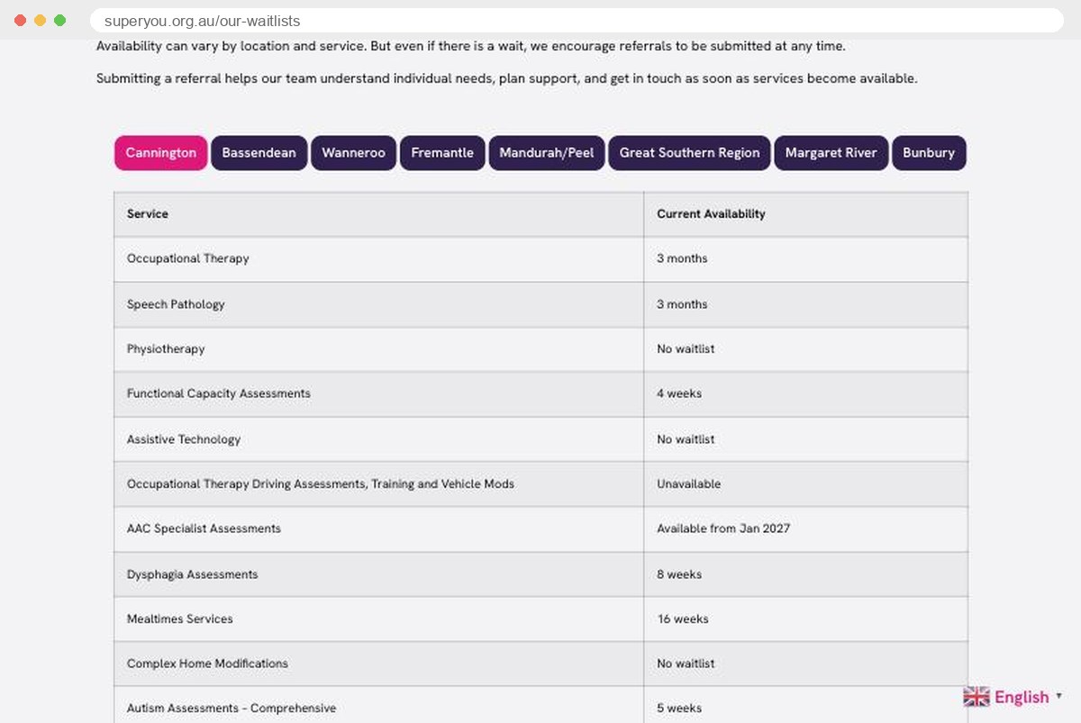
Everyday Independence publishes a date (“as of 2 November 2026”) and groups availability by state and hub, though it doesn’t show wait times. Put the two together and you have the model:
- availability by service and by location
- a wait time or “taking new clients now”
- the date you last updated it, and a reminder in someone’s calendar to update it every fortnight
Build a referral form for coordinators, not a generic contact form
A “Contact us” form with name, email and message makes a coordinator do the work twice: fill in your form, then answer your follow-up email asking for everything you should have asked the first time.
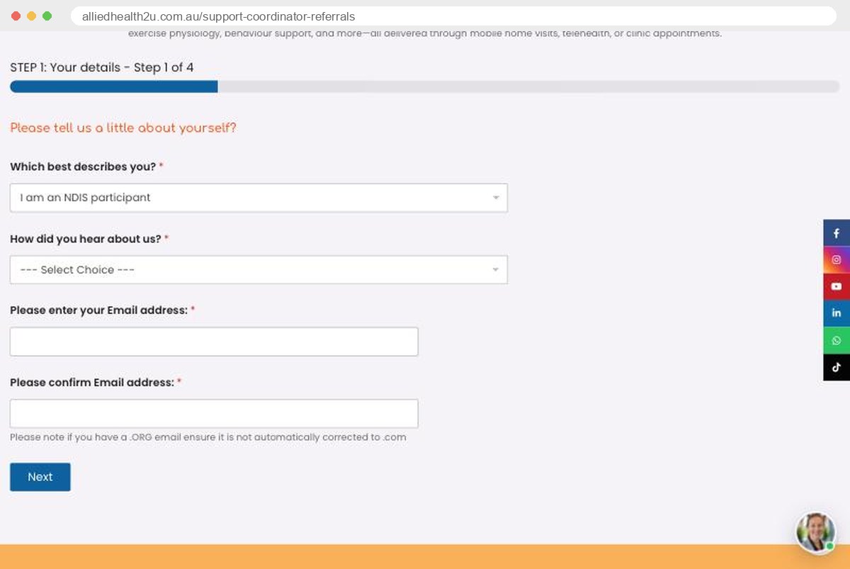
Allied Health 2U’s support coordinator referral form gets the structure right. It’s laid out the way a coordinator thinks: who’s referring, the participant’s details (including preferred name and pronouns), NDIS number, plan dates, how the plan is managed and the plan manager’s invoice email, then the services needed, interpreter needs and any safety risks, with space to upload the relevant parts of the plan. Two things I’d change. It doesn’t say how quickly they’ll respond, and it asks for the email address twice, which is friction for anyone and harder for some people with disability. The latest web accessibility standard, WCAG 2.2, added a criterion (3.3.7, Redundant Entry) that generally expects information needed again in the same process to be filled in automatically or available to select.
Positive Step, a mobile OT service in Perth, does something I rarely see: alongside its NDIS, aged care and other referral forms, it gives people who are Deaf or hard of hearing their own referral pathway. That’s thinking about access at the start of the journey, not adding it on top.
What your referral form should ask, and no more than it needs:
- referrer’s role and contact details
- participant’s name, preferred name and best way to contact them
- NDIS number, plan start and end dates, and how the plan is managed
- the support needed, preferred location or mode, and any interpreter or communication needs
- if the referral is made on someone’s behalf, confirmation they agree to their details being shared
- a short privacy note on the form saying what you collect, why and who sees it
Ask for plan documents later, through a secure intake step, and only the parts you need. Then say, on the form and in the confirmation email, when you’ll reply. “Within one business day” is a promise coordinators remember. (If you’re tempted to thank referrers with gifts, read what you can and can’t offer referrers first.)
Say what happens after someone enquires
Families hesitate to enquire when they don’t know what they’re signing up for. A short “what happens next” section takes that fear away.
Activate Allied Health, a small speech pathology and OT clinic in Melbourne, does this well. Its NDIS page sets out four steps (get in touch, initial assessment, your therapy plan, therapy and regular reviews), explains which NDIS budget the support usually comes from and how payment works for agency-, plan- and self-managed participants. The only thing I’d add is time: how long between steps one and two?
Name your service area like a local
“We service Greater Sydney” tells a family in Campbelltown nothing. Name the suburbs or regions, and say how far you travel.
The Junction Works in South-West Sydney puts it plainly: offices in Austral and Busby, in-person visits across the council area “and up to 30 minutes beyond”, plus phone and telehealth. Activate lists the suburbs it covers by name. That helps people and search engines: a page for each service and area is also how you get found, which our NDIS SEO guide covers in more detail.
An accessible NDIS website is built that way, not bolted on
Here’s where I disagree with a lot of NDIS web design pages. Several recommend an “accessibility widget”: the little toolbar that lets visitors change text size or contrast. Those overlays can help some people, but they don’t make an inaccessible site accessible. If your headings are a mess, your forms can’t be used with a keyboard and your photos have no descriptions, a toolbar on top won’t fix it.
What to aim for instead:
- WCAG 2.2 Level AA as your design target. The Australian Human Rights Commission’s 2025 guidelines on equal access to digital goods and services point organisations to the latest published version of WCAG, and the NDIS Commission’s goal for its own website is WCAG 2.2 Level AA as a minimum. Most NDIS web design pages still quote the older 2.1.
- Plain language. The Australian Government Style Manual recommends writing to a Year 7 level. “Capacity Building – Improved Daily Living” can stay, but explain it in a sentence.
- Easy Read for the pages that matter most: your services, how to start and how to complain. Autism Queensland publishes Easy Read versions of its policies, including feedback and complaints.
- An accessibility statement. Plan Partners’ is a good model: it says which standard it’s working to, what it supports, and, unusually, what still doesn’t work well, with a way to report problems.
This isn’t box-ticking. The ABS counted 5.5 million Australians with disability in 2022, and most of the people looking at your website are among them or support someone who is.
Trust is real people, real qualifications and a complaints page
People choosing a provider want to see who will turn up. Positive Step’s team page shows seven named OTs with photos, their degree and the year they graduated, and their areas of interest. That beats a stock photo of smiling hands every time.
The other trust signal is how you handle complaints. For registered providers, the NDIS Practice Standards expect participants to know how to make a complaint, including avenues outside the provider and their right to an advocate. The Standards don’t say “put it on your website”, but the website is the easiest place to show it. National PBS, a small behaviour support provider, includes its feedback options on its contact page alongside the NDIS Commission’s phone, TTY and online complaint details. Add an anonymous option and how quickly you respond, and you’re ahead of most.
What we changed on Auscare’s website
For Auscare Support, a plan management and support coordination provider, the website was one part of a bigger job: participant stories on video, Google and Microsoft Ads, paid social and educational content. On the website side, we designed a new site and campaign landing pages that were easy to use on a phone, with original illustrations instead of stock photos. We mapped what happens after each enquiry so every path ended with a call from the Auscare team, and we tracked every channel, from ads and calls to forms and live chat.
Within six months, Auscare’s client base had doubled. The website didn’t do that alone, and I wouldn’t claim it did. But it’s where the other channels sent people, and it made the next step obvious.
A five-minute test before you sign off a new site
Before you approve a new or updated site, try this yourself, or better, ask a participant or coordinator you know to try it. On a phone, find out whether you have OT (or your main service) available in a suburb you cover. Then, using only the keyboard on a computer, start a referral, make a mistake in a field, fix it, and find out when you’ll hear back. If any step is confusing, it will be for your visitors too. It’s not a substitute for a proper WCAG audit, but it catches the problems that cost you referrals.
The NDIS website checklist to give whoever builds your site
Send this to your web designer, or use it to check your current site:
- Does every service page say who it’s for, where, and how to start, in plain words?
- Is there a dated availability or waitlist page, by service and location?
- Is there a referral form built for coordinators, with the fields above and a stated response time?
- Is there a short “what happens next” section on each service page?
- Are service areas named by suburb or region, with how far you travel?
- Does the site meet WCAG 2.2 AA, tested with a keyboard and a screen reader, not just an overlay?
- Are the key pages available in Easy Read, and is there an accessibility statement?
- Does the team page show real people and their qualifications?
- Is there a complaints page with internal and external options, an anonymous option and advocacy information?
- Does every form say what personal information you collect and why?
If you’d like help with any of it, that’s what our website design team does, or get in touch for a review of your current site.
So, take one honest look at your homepage: could a coordinator tell in ten seconds whether you can help, where, and when?
Frequently Asked Questions
What should an NDIS provider website include?
Clear pages for each service and area, current availability, a referral form for support coordinators, a “what happens next” section, team profiles with qualifications, an accessibility statement and a complaints page with external options. It should meet WCAG 2.2 AA, use plain language and make calling you as easy as filling in a form.
Does an NDIS website have to meet WCAG?
There’s no single law that says “WCAG”, but the Disability Discrimination Act applies to websites, and the Australian Human Rights Commission’s 2025 guidelines point organisations to the latest version of WCAG, currently 2.2. The guidelines aren’t law in themselves. WCAG 2.2 Level AA is the sensible design target; it’s also the NDIS Commission’s goal for its own website.
Do accessibility widgets make a website compliant?
No. An overlay or toolbar can help some visitors adjust text or contrast, but it doesn’t fix the underlying problems, like forms that can’t be used with a keyboard or images without descriptions. Build the site to WCAG 2.2 AA and test it, then add a widget only if it genuinely helps.
Should NDIS providers show their availability online?
Yes, if you can keep it current. It saves support coordinators a round of phone calls when you say upfront which services and locations have capacity. Show availability by service and location, include wait times or “taking new clients”, and date the page so visitors know it’s up to date.
What should a support coordinator referral form ask?
The referrer’s role and contact details, the participant’s details and preferred contact method, NDIS number, plan dates and management type, the support needed, location, interpreter or communication needs, confirmation the participant agrees to the referral, and a short privacy note. Ask for plan documents later, securely. Then state when you’ll respond.